

WOODSUCCES
A site that hid its own best argument
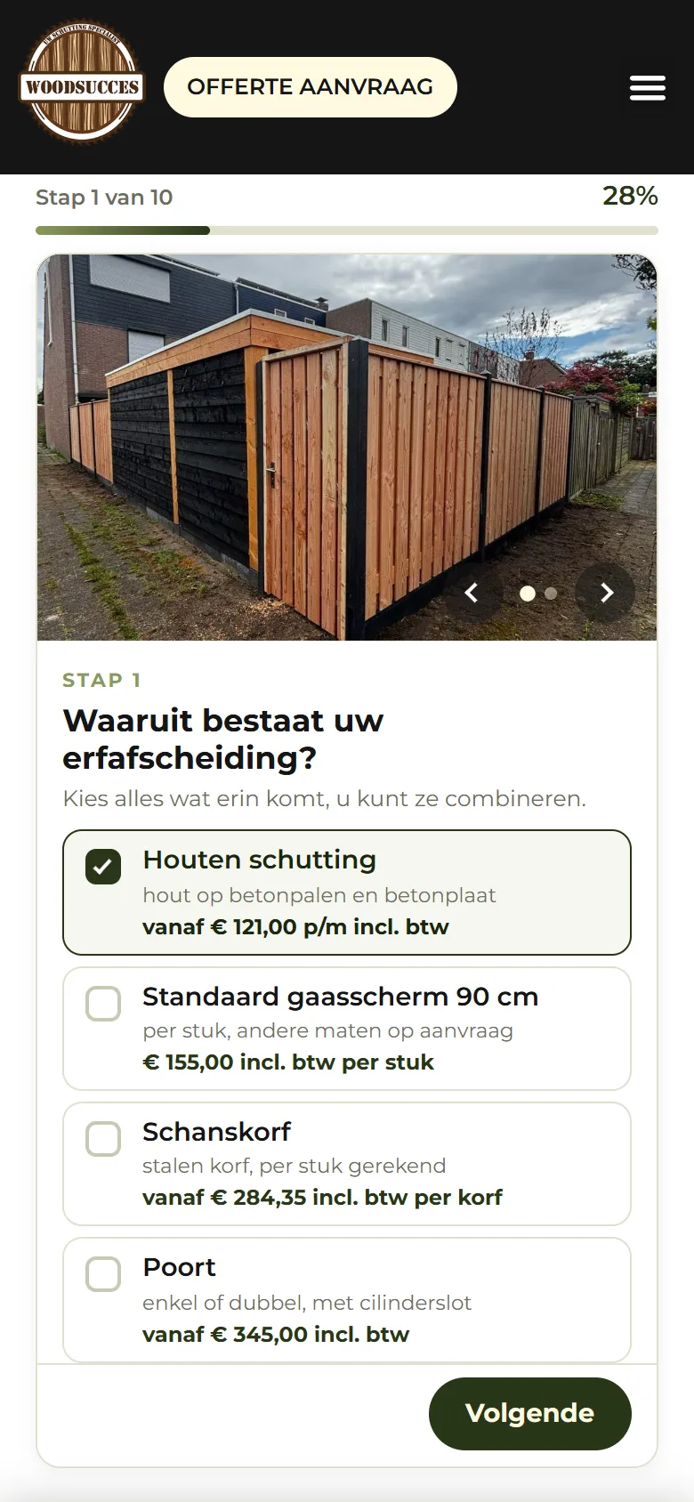
Woodsucces installs fences and gates across the Netherlands, at prices that include VAT and installation. That last part is unusual in this trade, and it sat only on ten product pages deep inside the site. On a phone there was no button to request a quote until 92% scroll depth.
- A route to the quote on screen on every page, instead of at 92% scroll depth
- The homepage from 21.19 MB down to 0.61 MB on a phone
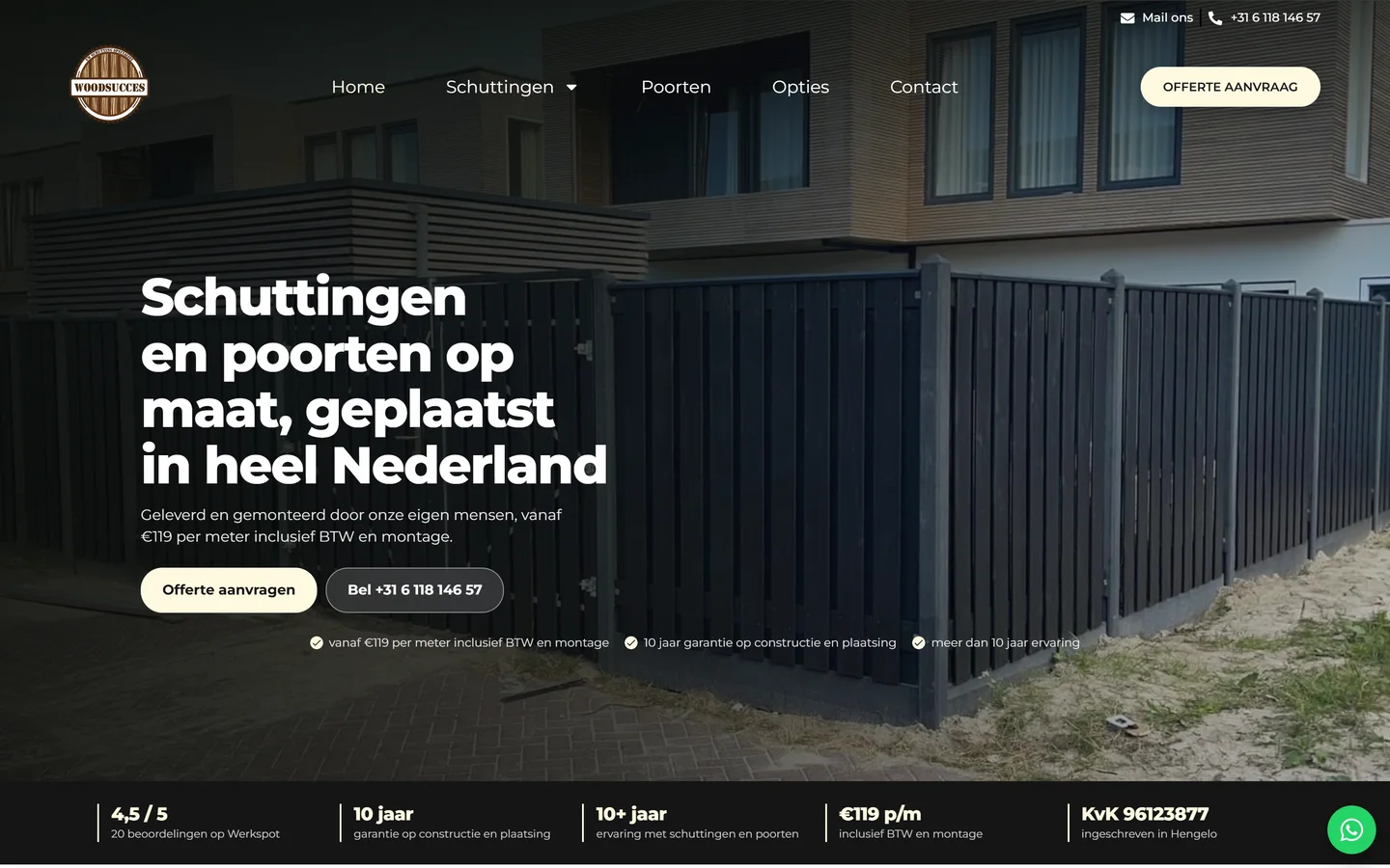
- His price per metre, VAT and installation included, finally in the first screen
- Customer
- Woodsucces
- Industry
- Fencing and gates
- Type
- Optimization
- Platform
- WordPress, rebuilt as a static site
-
The problem
On a phone you could not request anything
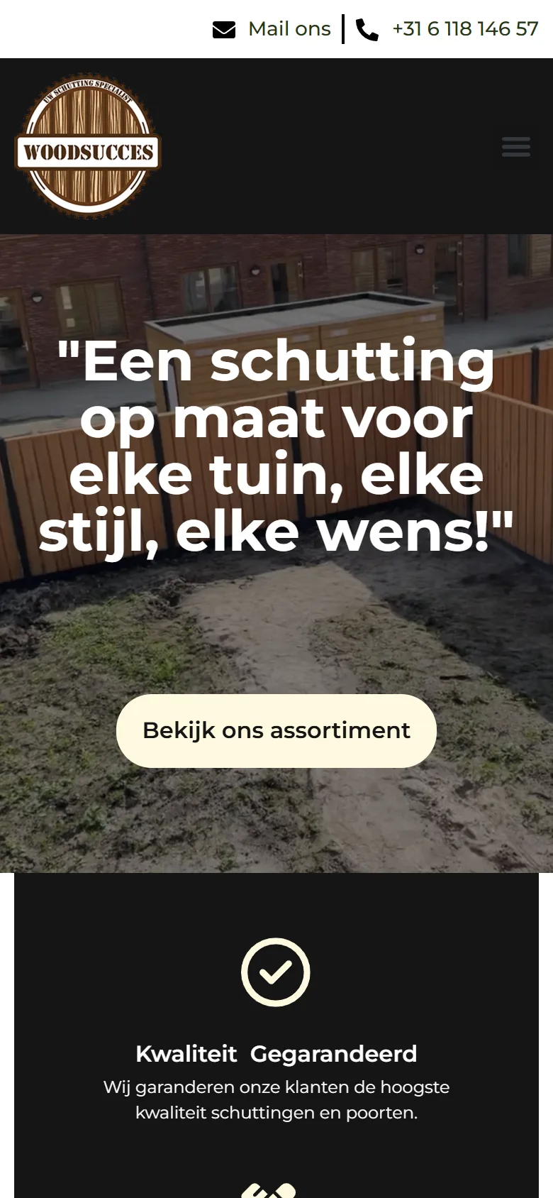
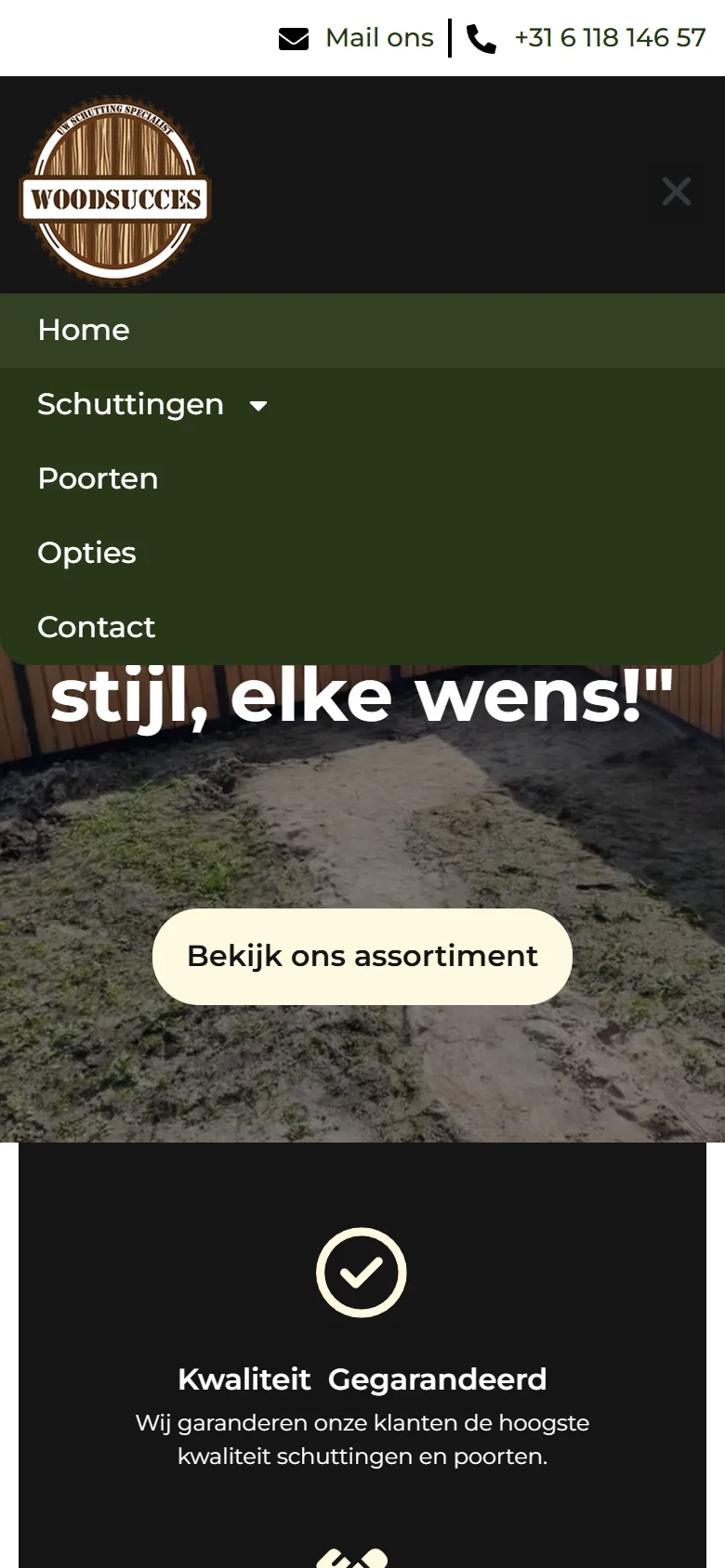
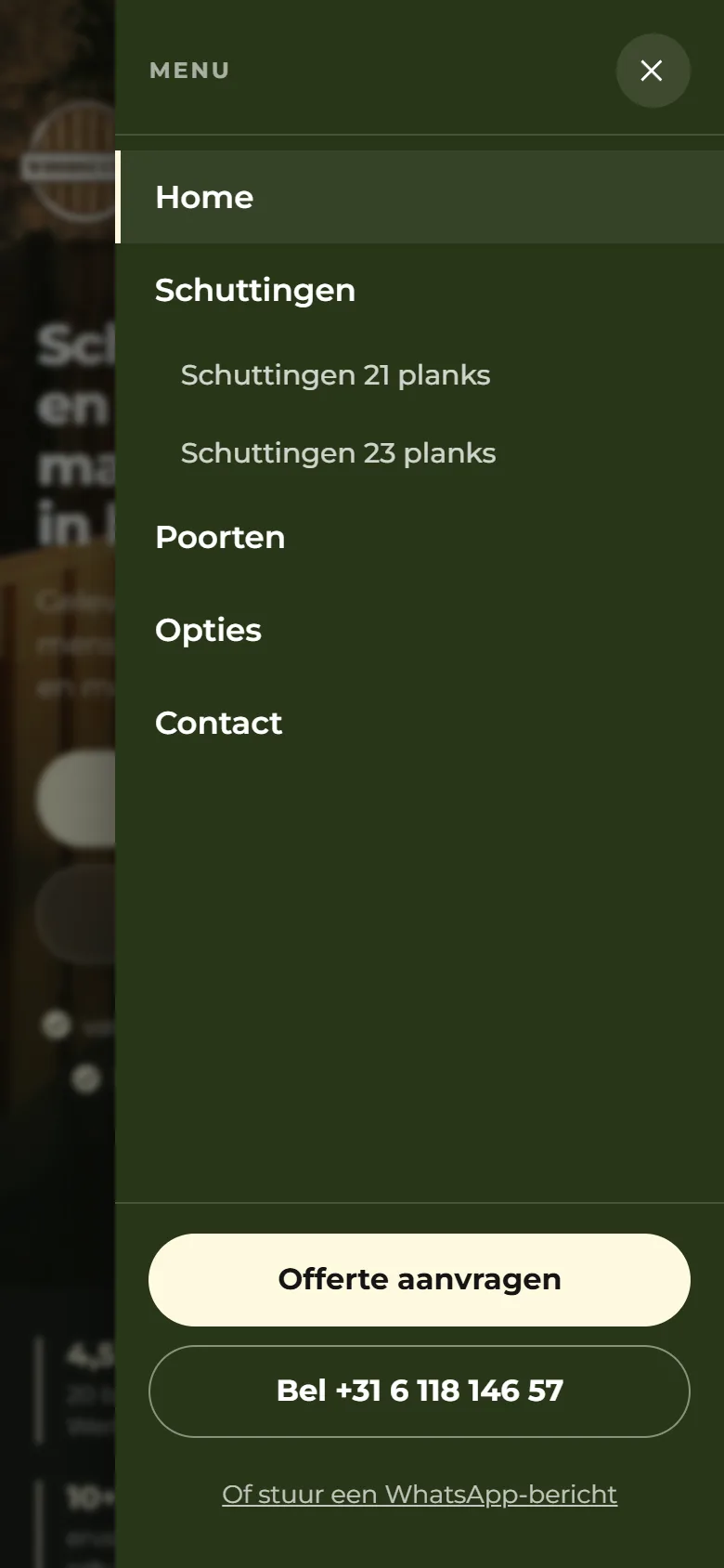
The quote button was in the markup on every page, but below 768 pixels the theme set it to display:none, so it rendered at 0 by 0. It was not in the dropdown menu either. The only working route to the quote form was a text link in the footer, 16 pixels tall, at 92.4% scroll depth. The header was position static as well, so on a laptop the button left at the first scroll of a nearly 3000 pixel page and never came back.
The top of the page sold nothing
There was not a single h1 across the nineteen pages. The homepage headline sat in quotation marks and named no service, no place and no price. Behind it ran sixty seconds of footage of a building site under construction: churned mud, fence panels still wrapped, and another company’s banners legible in frame. That video alone was 19.9 MB.
His strongest argument was nowhere
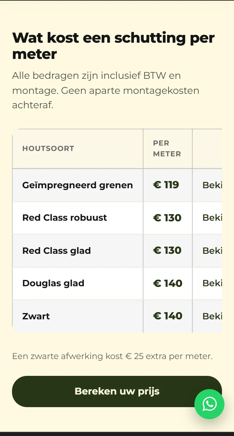
Prices from €119 per metre including VAT and installation sit on ten product pages. On the homepage the euro sign did not appear once. No review, no chamber of commerce number, no guarantee in sight: zero proof, on a purchase where a stranger digs up your garden for a four figure sum.
-
What I did
A route to the quote that never disappears
The button was made visible on mobile, the header travels with the page, and a bar with call and request a quote appears at exactly the moment that button leaves the screen. The rule is written that literally: the bar is there when the header button is not on screen. Measured on every page and at every scroll position, and there is always a visible route.
A first screen that shows the work
The video out and his own photograph edge to edge, with the navigation over it instead of above it. A real h1 that names the service, the area and the price band. Two buttons side by side: request a quote, and call. His brand was left alone: same colours, same logo, his own photographs.
The price, the proof and the questions brought forward
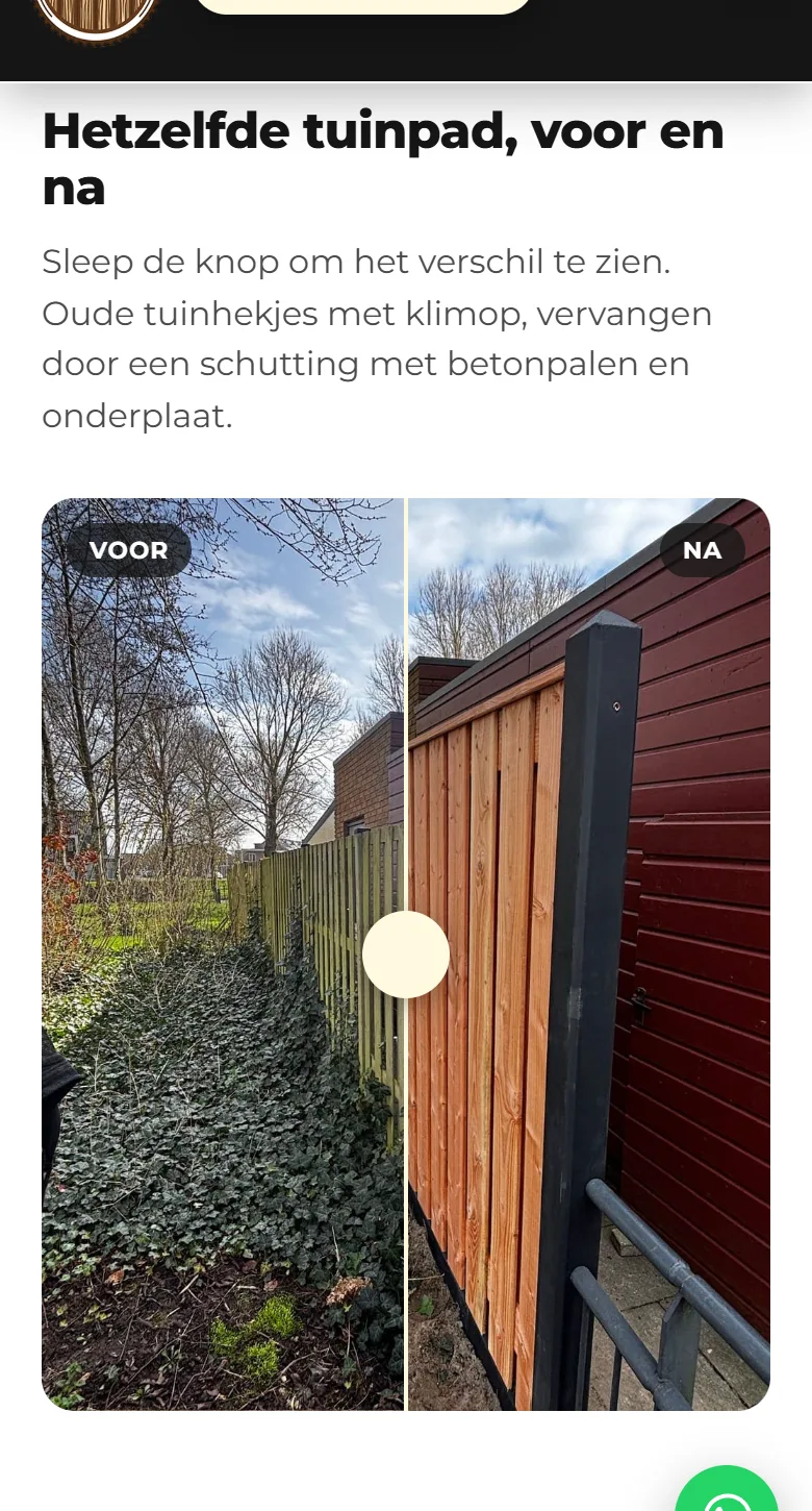
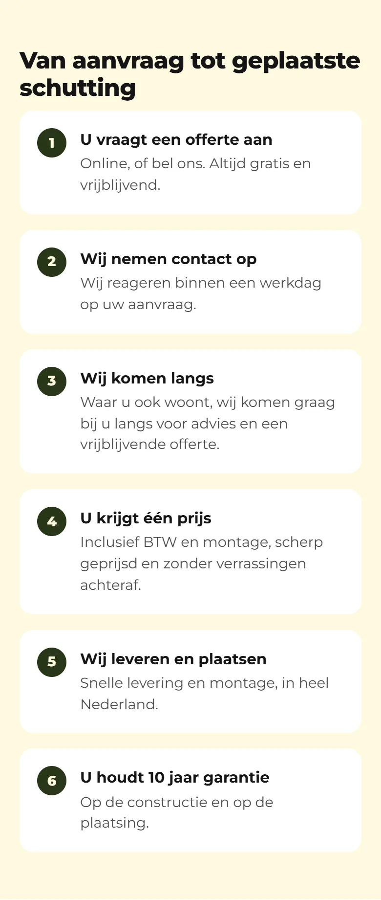
A price table per timber type on the homepage. A strip carrying the chamber of commerce number, ten year guarantee and ten years of experience, all of it checkable. A before and after slider built from two photographs he shot himself in the same spot. Six steps from request to installed fence, and nine frequently asked questions with the answer in the first sentence.
From 21.19 MB to 0.61 MB
The 19.9 MB video was replaced by a photograph. All 151 remaining images were re-encoded and capped at 1400 pixels, and every srcset descriptor and every width and height in the HTML was moved to the size the file actually has now. Without that last part a browser picks on wrong information and the layout jumps while loading.
Findable, for an assistant too
Every page now has one h1, its own title and its own description, plus share tags so a link on WhatsApp or Facebook no longer appears as a grey card. On top of that JSON-LD, an llms.txt, and a robots.txt that names OAI-SearchBot and GPTBot explicitly, each with its own rule. What is sold here is eligibility, never a position: nobody can promise a place in a ChatGPT answer.
-
The result
The homepage now transfers 0.61 MB on a phone, against 21.19 MB before, and the whole folder went from 89 MB to 26 MB. On every page and at every scroll position there is a route to the quote on screen. His price per metre, VAT and installation included, sits in the first screen instead of ten clicks deep. Along the way three broken card buttons and two dead footer links surfaced that were invisible on every page; those were fixed too. All of it runs through generators that produce the same file when run twice, and a check script of 104 measurements that stands at zero failures.

The difference
Before
After

Before
After
Before

After
New

New
New

New
New
Site not selling anything?
The audit is free and commits you to nothing.